
Responsive Website Design: Why It Matters
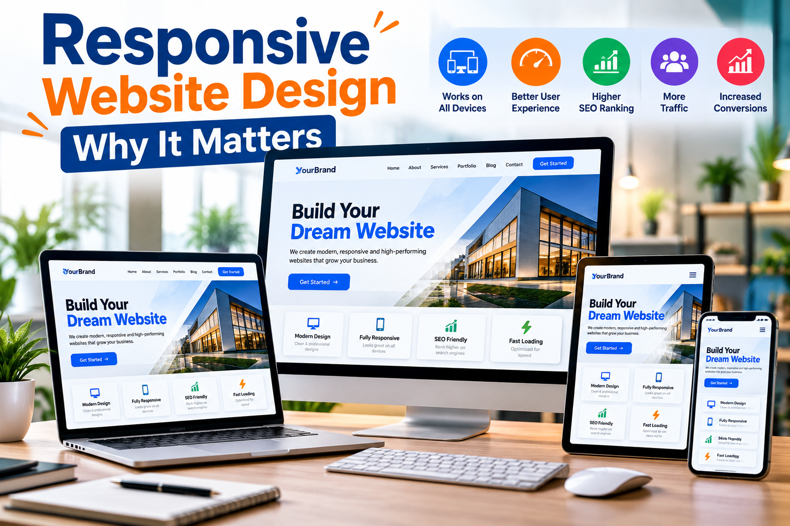
In today’s digital world, people access websites from a wide variety of devices. Some users browse on desktop computers, while others use laptops, tablets, smartphones, smart TVs, and devices with different screen sizes. Because of this diversity, businesses can no longer design websites exclusively for desktop users.
This is where responsive website design becomes essential.
Responsive website design allows a website to automatically adjust its layout, images, text, navigation, and other elements according to the screen size and device being used. Instead of creating completely separate websites for mobile and desktop visitors, responsive design provides a flexible website that delivers a consistent experience across devices.
A responsive website is not simply about making a website look attractive on smartphones. It can also influence usability, customer engagement, search visibility, conversions, brand perception, and overall website performance.
In this article, we will explore what responsive website design is, why it matters, its major benefits, important design practices, and why businesses should prioritize responsive web development.
What Is Responsive Website Design?
Responsive website design is an approach to web development in which a website's structure and content automatically adapt to different screen sizes and resolutions.
For example, a website displayed on a large desktop monitor may have multiple columns, a wide navigation menu, and large images. When the same website is opened on a smartphone, those elements can automatically reorganize into a mobile-friendly layout.
The objective is simple: visitors should be able to comfortably browse and interact with a website regardless of the device they use.
Responsive websites commonly rely on flexible layouts, CSS media queries, scalable images, adaptable typography, and mobile-friendly navigation.
Rather than forcing mobile visitors to zoom, scroll horizontally, or struggle with tiny buttons, responsive design creates an interface that fits naturally within their screens.
How Does Responsive Web Design Work?
Responsive design uses modern web development techniques to determine how content should appear at different screen widths.
One of the most important components is a fluid grid system. Instead of defining every website element using fixed dimensions, developers can use flexible measurements so that elements expand or shrink according to available space.
Another important technique involves CSS media queries. Media queries allow developers to apply different styling rules based on characteristics such as screen width.
Images can also be made responsive so they resize appropriately rather than extending beyond the user's screen.
Responsive design therefore combines multiple technologies and design principles to create a flexible browsing experience.
Responsive vs Non-Responsive Website
Understanding the difference between responsive and traditional fixed-width websites helps demonstrate why responsive design has become so important.
| Feature | Responsive Website | Non-Responsive Website |
|---|---|---|
| Mobile Friendly | Yes | Often limited |
| Screen Adaptability | Automatically adjusts | Usually fixed layout |
| User Experience | Optimized across devices | May vary significantly |
| Navigation | Device-friendly | Can be difficult on mobile |
| Content Readability | Easy to adjust | May require zooming |
| Horizontal Scrolling | Usually avoided | Often possible |
| SEO Friendliness | Supports mobile SEO | Can create usability issues |
| Maintenance | One flexible website | Separate versions may be required |
| Conversion Potential | Generally better UX | Poor mobile UX may reduce conversions |
For modern businesses, responsive design provides a more flexible foundation because a single website can serve users across multiple devices.
Why Responsive Website Design Matters
1. Mobile Usage Has Changed How People Browse
Smartphones have become one of the primary ways people access online information.
Potential customers may discover your business through a search engine, social media platform, advertisement, email, or direct website link while using their phones.
If they arrive at a website that is difficult to use, they may leave before learning about the company's products or services.
Responsive design ensures that visitors can conveniently access important information regardless of their device.
This is particularly important for local businesses, e-commerce websites, service providers, educational organizations, restaurants, agencies, and companies that receive significant mobile traffic.
2. Responsive Design Improves User Experience
User experience, commonly called UX, plays an important role in the success of a website.
Visitors generally expect websites to be simple, fast, readable, and easy to navigate.
Imagine opening a website on your smartphone and finding that:
The text is extremely small.
Buttons are difficult to tap.
Images extend outside the screen.
Navigation is difficult to access.
You need to zoom repeatedly.
The page requires horizontal scrolling.
Most visitors would find that experience frustrating.
Responsive website design helps eliminate many of these problems by adjusting the interface according to the user's screen.
A positive user experience can encourage visitors to explore additional pages, learn more about products, complete forms, make inquiries, or purchase products.
3. Responsive Design Supports SEO
Search engine optimization, or SEO, helps websites improve their visibility in search results.
Mobile usability is an important consideration when creating an SEO-friendly website. A website that performs effectively across devices provides a stronger technical and usability foundation for search optimization.
Responsive design can help SEO by providing one primary version of website content rather than unnecessarily maintaining separate mobile and desktop websites.
This makes it easier to manage:
Page URLs
Website content
Internal links
Metadata
Structured information
Website updates
However, responsive design alone does not guarantee higher search rankings. Businesses must also consider content quality, page speed, technical SEO, backlinks, search intent, and other ranking factors.
4. It Can Reduce Bounce and Abandonment
When visitors open a website and immediately find it difficult to use, they are more likely to leave.
This can happen when content does not fit the screen or important elements are difficult to access.
Responsive design creates a smoother experience that encourages visitors to stay and interact with the website.
For example, an online store should allow mobile visitors to easily browse categories, inspect products, add items to their cart, and complete checkout.
Removing unnecessary usability barriers can reduce abandonment and improve engagement.
5. Responsive Websites Can Improve Conversions
A website is often designed to achieve a specific business objective.
Depending on the organization, conversions might include:
Purchasing a product
Submitting an inquiry
Booking an appointment
Calling the company
Registering an account
Downloading an application
Requesting a quotation
Subscribing to a service
Responsive design makes these actions easier across different devices.
For instance, a potential customer who discovers a service company on their smartphone should be able to quickly understand the service, read important information, and tap a clearly visible Contact Us or Get a Quote button.
Every unnecessary step or usability issue can create friction in the conversion journey.
6. One Website Works Across Multiple Devices
One of the biggest advantages of responsive website design is flexibility.
Businesses do not necessarily need completely different websites for desktop, tablet, and mobile visitors.
A properly developed responsive website can automatically adapt to various devices.
This creates a more consistent experience and makes website management significantly easier.
When new content is published, businesses can maintain one central website rather than updating several device-specific versions.
7. Responsive Design Can Save Development and Maintenance Costs
Maintaining separate desktop and mobile websites can require additional development and management resources.
Every time a business needs to update content, functionality, pricing, images, or other information, multiple versions might require modification.
Responsive web design can simplify this process.
Businesses can invest in one flexible website capable of serving multiple device categories.
The initial development still requires proper planning, design, coding, and testing, but long-term website administration can become easier.
8. It Helps Build Brand Credibility
Your website often creates a potential customer's first impression of your business.
A professional website can communicate reliability, attention to detail, and credibility.
On the other hand, an outdated website that performs poorly on mobile devices can negatively affect brand perception.
Visitors may wonder whether the business is active or trustworthy when its website appears neglected.
Responsive design helps businesses maintain consistent branding across desktops, smartphones, and tablets.
Logos, typography, colors, images, and other visual elements can remain recognizable while adapting to different layouts.
9. Responsive Design Helps E-Commerce Websites
Responsive design is particularly important for e-commerce.
Online shoppers may discover products on social media or search engines and immediately open the product page on their phones.
An e-commerce website should make it easy to:
Search for products
Browse categories
View product images
Read descriptions
Select variations
Add products to the cart
Enter shipping information
Complete payments
A poorly optimized mobile shopping experience can create unnecessary obstacles before checkout.
Responsive design helps create a smoother buying journey across devices.
10. Better Social Media Traffic Experience
A significant amount of website traffic can originate from social media platforms.
Businesses regularly share website links through social posts, advertisements, profiles, and messaging platforms.
Many users accessing those links are likely to be using smartphones.
Therefore, even a strong social media campaign can underperform if users land on a website that does not work properly on mobile devices.
A responsive landing page provides a smoother transition between social media content and the business website.
Important Elements of Responsive Website Design
Creating an effective responsive website involves much more than shrinking desktop content.
Developers and designers should consider several important components.
Flexible Layout
The layout should automatically adapt according to available screen width.
Desktop designs may display content in multiple columns, while smaller screens may stack the same sections vertically.
This keeps content organized and readable.
Responsive Images
Large images can cause layout and performance problems when they are not properly optimized.
Responsive images should scale according to the user's screen while maintaining appropriate visual quality.
Developers can also serve different image sizes depending on device requirements.
Mobile-Friendly Navigation
Desktop websites often have enough space for full navigation menus.
Smartphones have much less available screen width.
Responsive websites can use compact menus or other mobile-friendly navigation patterns so visitors can easily access important pages.
Readable Typography
Users should not need to zoom just to read website content.
Font size, spacing, line height, and text width should be optimized for readability across screen sizes.
Touch-Friendly Buttons
Mobile users interact with websites using their fingers rather than a mouse.
Buttons, links, forms, and other interactive elements therefore need sufficient size and spacing.
Important call-to-action buttons should also be clearly visible.
Website Speed
Responsive design should be combined with performance optimization.
Large images, unnecessary scripts, excessive animations, and poorly optimized code can slow down a website.
Businesses should focus on delivering a fast experience, especially for visitors using mobile networks.
Responsive Website Design Best Practices
Developers should follow several principles when building responsive websites.
| Best Practice | Purpose |
|---|---|
| Mobile-First Design | Prioritize essential content for smaller screens |
| Flexible Grid | Allow layouts to adapt naturally |
| Responsive Images | Prevent oversized media and improve performance |
| Clear Navigation | Help users quickly find important pages |
| Readable Fonts | Improve content accessibility |
| Touch-Friendly Elements | Make mobile interactions easier |
| Performance Optimization | Reduce loading delays |
| Cross-Device Testing | Identify layout problems |
| Simple Forms | Improve mobile form completion |
| Clear CTA Buttons | Encourage desired user actions |
These practices help create websites that are functional rather than merely visually responsive.
What Is Mobile-First Design?
Mobile-first design is an approach where designers begin by creating the experience for smaller screens and then progressively enhance the layout for larger devices.
This approach encourages teams to prioritize essential information.
Because smartphone screens provide limited space, designers must carefully determine which elements are most important.
Once the mobile experience is established, additional design features can be introduced for tablets, laptops, and desktop screens.
Mobile-first development can be especially effective for businesses whose customers frequently access their websites through smartphones.
Common Responsive Web Design Mistakes
Even websites labeled as responsive can contain usability problems.
One common mistake is simply shrinking desktop content without reconsidering how users interact with the page.
Another problem is using extremely large images that negatively affect mobile loading speed.
Other common issues include tiny buttons, complicated navigation menus, excessive pop-ups, unreadable fonts, overlapping content, long forms, and elements that extend beyond the screen.
Responsive websites should therefore be tested thoroughly.
Testing only one smartphone is not enough. Developers should examine multiple screen widths and browsers to identify potential layout problems.
Responsive Design and Website Performance
Responsive design and website performance should work together.
A website can technically adapt to a smartphone screen while still delivering a poor experience if it takes too long to load.
Performance optimization may include:
Compressing images
Using modern image formats
Reducing unnecessary JavaScript
Minifying CSS and JavaScript
Implementing caching
Using efficient hosting
Lazy-loading appropriate media
Removing unnecessary third-party scripts
Fast loading combined with responsive design creates a much stronger experience.
Who Needs a Responsive Website?
Almost every organization with an online presence can benefit from responsive design.
It is particularly valuable for:
Small businesses: Customers may search for services from smartphones.
E-commerce companies: Mobile shoppers need a smooth purchasing experience.
Restaurants: Visitors often search for menus, addresses, opening hours, and contact details on mobile devices.
Educational institutions: Students may access courses and information using different devices.
Digital agencies: A responsive website demonstrates professional web development standards.
Healthcare and professional services: Visitors may need to quickly find services, contact information, or appointment options.
Bloggers and publishers: Readers consume articles across smartphones, tablets, and desktops.
Regardless of industry, businesses should ensure their websites provide a consistent and usable experience.
Is Responsive Website Design Worth the Investment?
For most modern websites, responsive design should be considered a fundamental requirement rather than an optional feature.
Businesses depend on their websites for marketing, customer communication, lead generation, online sales, and brand awareness.
If the website works effectively only on desktop computers, the organization risks providing a poor experience to visitors using other devices.
Responsive design helps create a website that can serve a broader audience while simplifying content management.
The actual return on investment depends on factors such as website traffic, business model, design quality, performance, marketing strategy, and conversion optimization.
However, building a website that works effectively across devices creates a stronger foundation for digital growth.
Future of Responsive Website Design
The range of internet-connected devices continues to evolve.
Websites are no longer viewed only on traditional desktop computers and standard smartphones. Screen dimensions, resolutions, device capabilities, and user behavior continue to change.
This makes flexible design increasingly important.
Modern web development is moving toward interfaces that adapt not only to screen size but also to different user contexts and accessibility requirements.
Businesses should therefore avoid designing websites for one specific device.
Instead, they should build flexible digital experiences capable of adapting as technology changes.
Frequently Asked Questions About Responsive Website Design
What is responsive website design?
Responsive website design is a web development approach that allows a website's layout and content to automatically adapt to different screen sizes, including smartphones, tablets, laptops, and desktops.
Why is responsive web design important?
Responsive design is important because it improves usability across devices, supports mobile-friendly SEO practices, simplifies website management, and can help improve engagement and conversions.
Is responsive design good for SEO?
Yes. Responsive design provides a mobile-friendly website structure and allows businesses to maintain content under consistent URLs. However, SEO success also depends on content, technical optimization, website speed, authority, and many other factors.
What is the difference between responsive and mobile-friendly design?
A mobile-friendly website may simply function adequately on smaller screens, while a responsive website dynamically changes its layout based on available screen dimensions.
Does responsive design improve website speed?
Responsive design itself does not automatically make a website faster. Performance depends on factors such as image optimization, code quality, scripts, hosting, caching, and website architecture. Responsive development should therefore be combined with performance optimization.
How can I check whether my website is responsive?
You can resize your browser window and observe how the layout changes. Developers can also use browser developer tools to preview different screen sizes. Testing on real smartphones and tablets is recommended as well.
Do small businesses need responsive websites?
Yes. Small businesses can benefit significantly from responsive design because potential customers frequently search for local products and services using smartphones.
Conclusion
Responsive website design matters because today's internet users do not browse from a single type of device. Customers may discover your business from a desktop computer, tablet, smartphone, or another screen size, and they expect the website to work properly every time.
A responsive website provides flexible layouts, readable content, optimized navigation, touch-friendly interactions, and a more consistent experience across devices.
It can also support SEO, improve user engagement, simplify website maintenance, strengthen brand credibility, and remove unnecessary obstacles from the customer journey.
Responsive design should therefore be treated as an essential component of modern web development.
Businesses planning a new website or redesigning an existing one should focus not only on how the website looks on a desktop screen, but on how effectively it works for every visitor, on every screen.
Need help with a project like this?
Tell us your requirement — we reply with a scope, timeline and quote within 24 hours.
Get a Free Quote →