Professional UI/UX Design & IT Consulting Services
AjonTec provides UI/UX Design & IT Consulting services to help businesses, startups, organizations, and technology teams plan and improve their digital products and technology solutions. Services combine user-focused interface design, experience planning, technology assessment, product strategy, technical guidance, and implementation recommendations.
The objective is to create digital experiences that are clear, usable, accessible where applicable, visually consistent, technically practical, and aligned with business goals. Exact scope depends on project type, number of screens/pages, technology requirements, objectives, and agreed deliverables.
What Is Included
- UI/UX strategy and planning
- User experience research and analysis
- User flow planning
- Information architecture
- Wireframe design
- Website UI design
- Mobile app UI design
- Web application interface design
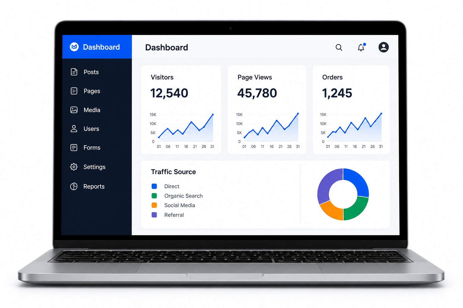
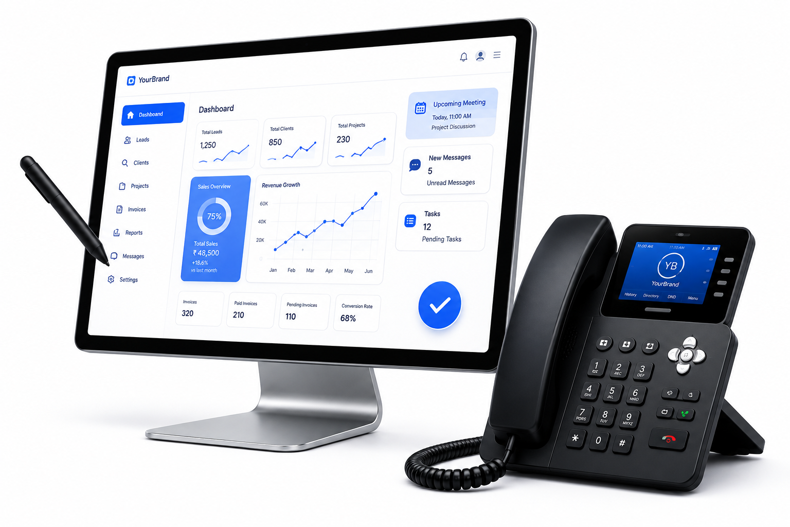
- Dashboard and admin panel design
- Design system planning
- Prototype design
- Usability recommendations
- Technology consulting
- IT infrastructure and software recommendations
- Technical project planning
UI & UX Design
UI design focuses on layouts, typography, colors, buttons, forms, navigation, cards, tables, dashboards, icons, components, responsive layouts, and other interface elements. UX design focuses on user journeys, information architecture, navigation, workflows, interaction patterns, and usability.
User Flows & Information Architecture
User flows describe the steps users take to complete tasks such as registration, purchasing, booking, submitting forms, or managing accounts. Information architecture organizes content, features, navigation, categories, and information structures so users can find information and complete tasks more easily.
Wireframes & Prototypes
Wireframes provide structured page or screen layouts before detailed visual styling. Interactive prototypes can demonstrate selected workflows before development. A prototype represents a design concept and is not automatically a fully functional production application.
Website & Mobile App UI/UX
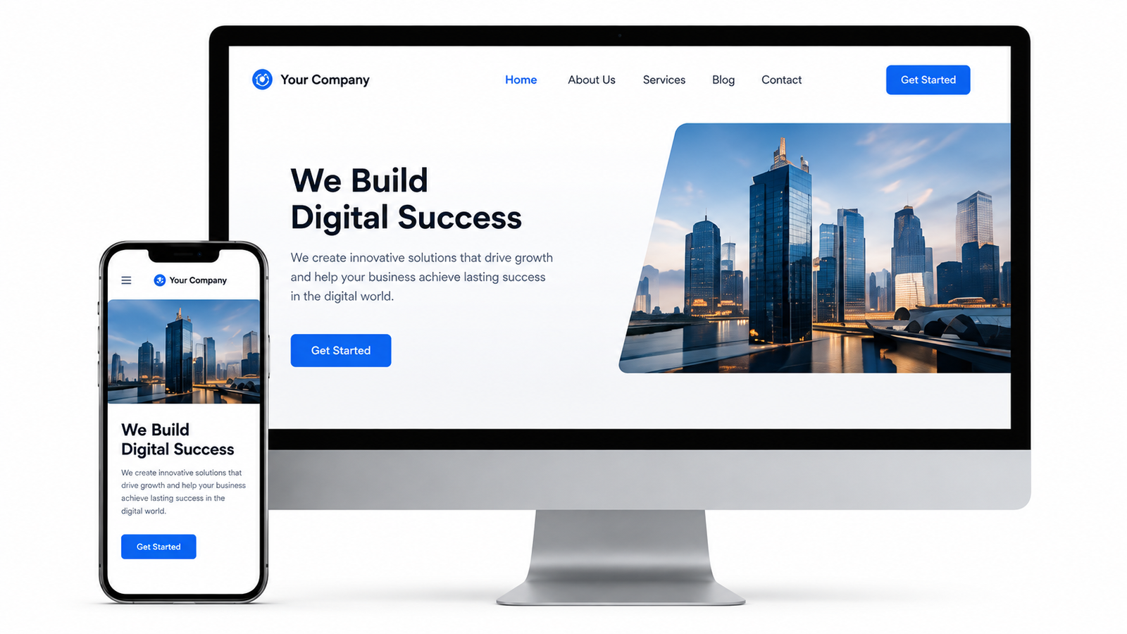
AjonTec can design corporate websites, e-commerce websites, landing pages, portals, mobile applications, SaaS platforms, dashboards, admin panels, and business applications. Responsive layouts can be prepared for supported desktop, tablet, and mobile requirements.
Design Systems
A design system can establish reusable colors, typography, spacing, buttons, inputs, cards, tables, navigation components, icons, states, and interaction patterns to support product consistency and maintainability.
IT Consulting
AjonTec provides IT consulting for software selection, application architecture, website and app planning, cloud infrastructure, system integration, business automation, digital transformation, and technology strategy.
Technology Assessment
Existing applications, websites, infrastructure, software environments, or workflows can be reviewed to identify technical issues, improvement opportunities, scalability considerations, and implementation requirements. Assessment depth depends on available documentation, source code, access, architecture, and agreed scope.
Digital Transformation
Consulting can identify manual or fragmented processes that may be improved through software, automation, integrations, centralized data, digital workflows, or other technology solutions.
Business Workflow Analysis
Workflows can be reviewed to understand how information moves between employees, departments, customers, software systems, and operational processes. This can identify opportunities for automation, integration, workflow simplification, role-based access, and reporting.
Typical UI/UX Services
- UX Research & Analysis
- User Journey Mapping
- User Flow Design
- Information Architecture
- Wireframing
- Website UI Design
- Mobile App UI Design
- SaaS UI Design
- Dashboard Design
- Admin Panel Design
- Design Systems
- Interactive Prototypes
- Responsive Design
- Usability Review
Typical IT Consulting Services
- IT Strategy Consulting
- Software Selection Consulting
- Technology Assessment
- Digital Transformation Consulting
- Business Process Analysis
- Software Architecture Planning
- Cloud & Infrastructure Consulting
- System Integration Planning
- Business Automation Consulting
- Technical Project Planning
- Application Modernization Consulting
- Technology Roadmap Development
Accessibility & Security Considerations
Where applicable, designs can consider readability, contrast, keyboard interaction, responsive layouts, clear labels, meaningful navigation, appropriate touch targets, and other usability and accessibility principles.
UI/UX planning can also consider authentication flows, permission-aware interfaces, sensitive-data handling, privacy controls, confirmation steps, error handling, and secure interaction patterns. UI/UX design alone does not guarantee application security or legal compliance.
Design Handoff
Approved designs can be prepared for development handoff with applicable specifications, components, assets, screen states, responsive behavior, and interaction details. The exact handoff format depends on the selected design tools and agreed requirements.
Process
- Requirement Discovery: Business objectives, users, systems, scope, and technical requirements are reviewed.
- Research & Analysis: Workflows, competitors, user needs, technology constraints, and project information are analyzed.
- Information Architecture: Content structures, navigation, journeys, and workflows are planned.
- Wireframing: Initial layouts and flows are developed.
- UI Design: Visual interfaces, components, typography, colors, spacing, states, and responsive layouts are designed.
- Prototype: Interactive prototypes are prepared where required.
- Technical Consulting: Technology options, architecture, integrations, infrastructure, and implementation are evaluated.
- Review & Handoff: Approved designs and recommendations are provided according to scope.
Important Legal & Business Information
- UI/UX design and IT consulting do not guarantee revenue, conversions, users, growth, or project success.
- Technology recommendations depend on information and requirements available at the time of consultation.
- The client is responsible for reviewing and approving designs, requirements, technology decisions, content, and implementation plans.
- IT consulting does not constitute legal, financial, tax, medical, or regulatory advice.
- Third-party technologies, APIs, hosting, licenses, and services have their own terms, pricing, availability, and limitations.
- Additional screens, revisions, consultations, or changed requirements may require additional charges.
Pricing
Pricing: As per Requirement
Pricing depends on number of screens/pages, complexity, research, prototypes, design systems, consultation duration, technical assessment, documentation, revisions, and other deliverables. Third-party subscriptions, premium assets, stock media, hosting, development, testing, licenses, and other external costs may be separate.
Why Choose AjonTec?
AjonTec combines UI/UX design thinking with practical technology consulting to help businesses plan digital products that are user-focused and technically realistic. The approach starts with understanding the actual business problem and then structuring experience, interface, technology requirements, and implementation around approved objectives.
What You Get
- UI/UX strategy and planning
- User experience research and analysis
- User flow planning
- Information architecture
- Wireframe design
- Website UI design
Technologies We Use
Frequently Asked Questions
What is UI/UX Design?
UI/UX Design combines user interface and user experience planning to create digital products that are structured, usable, understandable, responsive, and aligned with user and business requirements.
Does AjonTec design websites and mobile applications?
Yes. UI/UX design can cover websites, mobile applications, SaaS platforms, dashboards, admin panels, portals, and other supported products.
What is included in UX design?
Depending on the project: user flows, information architecture, wireframes, journeys, usability analysis, interaction planning, and prototypes.
Can you design an ERP or admin dashboard?
Yes. AjonTec can design ERP, CRM, billing, SaaS, admin, dashboard, and other complex business interfaces.
Do you provide clickable prototypes?
Yes, where included in the agreed scope. A prototype is not automatically a fully functional application.
What is IT Consulting?
It provides technology guidance for software, infrastructure, architecture, integrations, automation, digital transformation, and technology strategy.
Can you review existing software?
Yes. Technical and UX assessments can identify usability issues, technical considerations, workflow problems, and improvement opportunities.
Can UI/UX guarantee more sales?
No. Good design can support usability and conversion, but cannot guarantee sales, users, revenue, or growth.
What is the price?
**As per requirement**, depending on screens, complexity, research, prototypes, consulting, documentation, revisions, and scope.
Does IT consulting include legal advice?
No. IT consulting focuses on technology and business-system considerations. Specialized legal, tax, financial, medical, or regulatory advice should come from qualified professionals.